




Будьте в курсе
Узнавайте первыми о новостях в IELTS, тренингах и предстоящих ивентах для преподавателей
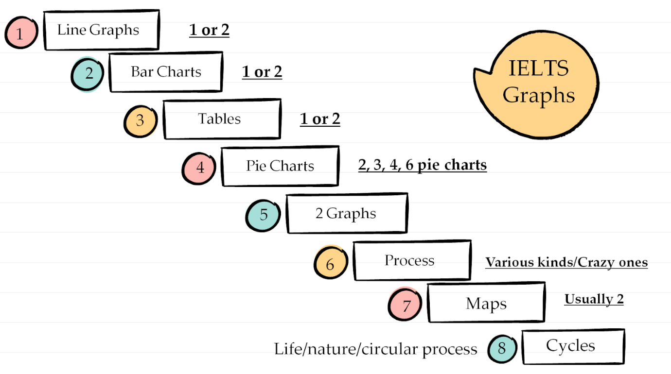
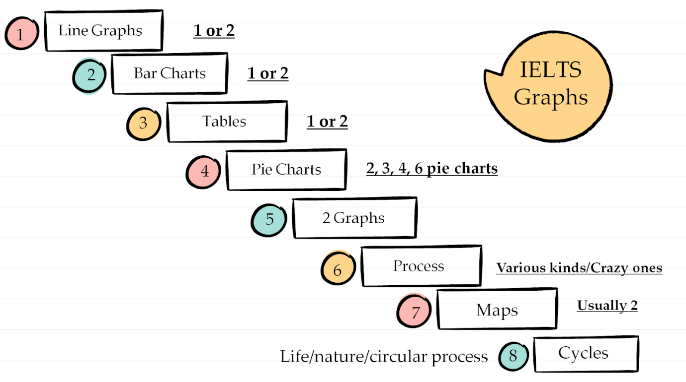
1. Tell your learner: here are all the graph types we have in IELTS. In the test you can get any type. 1 graph.
Let’s look at different kinds. Say what you see (name the type):
Here they are:
Today we’ll look at a line graph. This is the exam task:
WRITING TASK 1
You should spend about 20 minutes on this task.
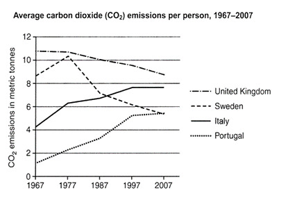
The graph below shows average carbon dioxide (Co2) emissions per person in the United Kingdom, Sweden, Italy and Portugal between 1967 and 2007.
Summarise the information by selecting and reporting the main features, and make comparisons where relevant.
Write at least 150 Words.
Можете разобрать что значит задание графика или дать это прочитать дома. Лучше на уроке.
….
Summarise the information by selecting and reporting the main features, and make comparisons where relevant.
Что это значит?
Summarise the information by selecting and reporting the main features - выбираем самое основное. Обо всем писать не нужно. Смотрите на график: что бросается в глаза? Самые большие цифры, маленькие и заметные изменения.
the main features - пишем про основные тренды и даём цифры из графика. Обычно the main features – это peaks, the lowest points, fluctuation (колебание) и стабильность, пересечение линий (overtake) в линейных графиках, а также самые высокие и низкие цифры. Всё, что бросается в глаза, когда вы смотрите на график. То, что разное и то, что одинаковое, сильно изменилось или осталось без изменений.
The main features варьируются в зависимости от графика, т.е. в одном такие, в другом другие. НО, вот основное на что обращать внимание в любом графике и проверять, что из этого он показывает.
The main features в графике – это
То, что бросается в глаза. То, что очевидно и сразу видно: основные тренды и изменения
Самое Самое: самые высокие цифры и самые низкие
Самые высокие точки (пики) и самые низкие точки (peaks, the lowest points)
Колебание (fluctuation) и стабильность (a period of stability)
Пересечение линий (overtake) в линейных графиках
Что сильно поменялось и в какой период были самые сильные изменения?
Что одинаковое? Что НЕ изменилось?
Исключения: всё выросло, но одно упало или всё было стабильно, но одно колебалось и менялось.
На баллы 8.0-9.0: если ли общий тренд (pattern), который связывает всю информацию на графике? Например, всё выросло или разница между странами снизилась к концу периода, т.е. в начале разница была большая, а потом уменьшилась.
make comparisons where relevant – сравниваем одно с другим. НЕ перечисляем, что произошло, а именно сравниваем. Как сравнивать и что такое Ping Pong стиль вы узнаете из главы “Как писать контраст или Ping Pong Style”. Главное: НЕ пишите через запятую всё, что видите на графике, а выбирайте и сравнивайте.
Прочитайте как планировать ответ на 8-9
Как планировать?
Или что делать когда увидели задание?
Перед тем как начать писать, нужно график “увидеть” и понять. НЕ пишите сразу. Вам нужно понять, как структурировать информацию, про что будете писать и как разделить информацию на параграфы. Как это сделать? Сначала вы смотрите на любой график и отвечаете на эти вопросы:
Иногда есть несколько правильных вариантов, как разделить информацию. Главное, вы должны понимать, как вы делите и почему так ДО того, как вы начали писать ответ. Схема/план у вас в голове ДО действия.
Когда понятно что и где писать, пишете ответ сразу в чистовик если на бумаге и печатаете если на компьютере.
Now, let’s analyse the task.
Analyse it by answering these questions:
The graph below shows average carbon dioxide (Co2) emissions per person in the United Kingdom, Sweden, Italy and Portugal between 1967 and 2007.
Summarise the information by selecting and reporting the main features, and make comparisons where relevant.
Write at least 150 Words.
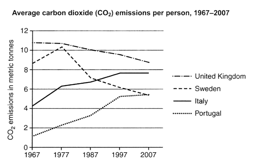
What are the main features? Highlight them in the graph:
Keys:
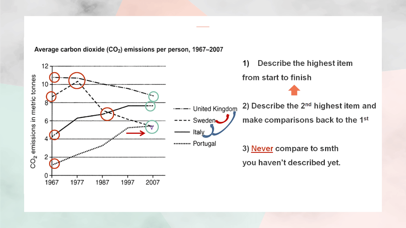
Here’s what we should write about in the body:
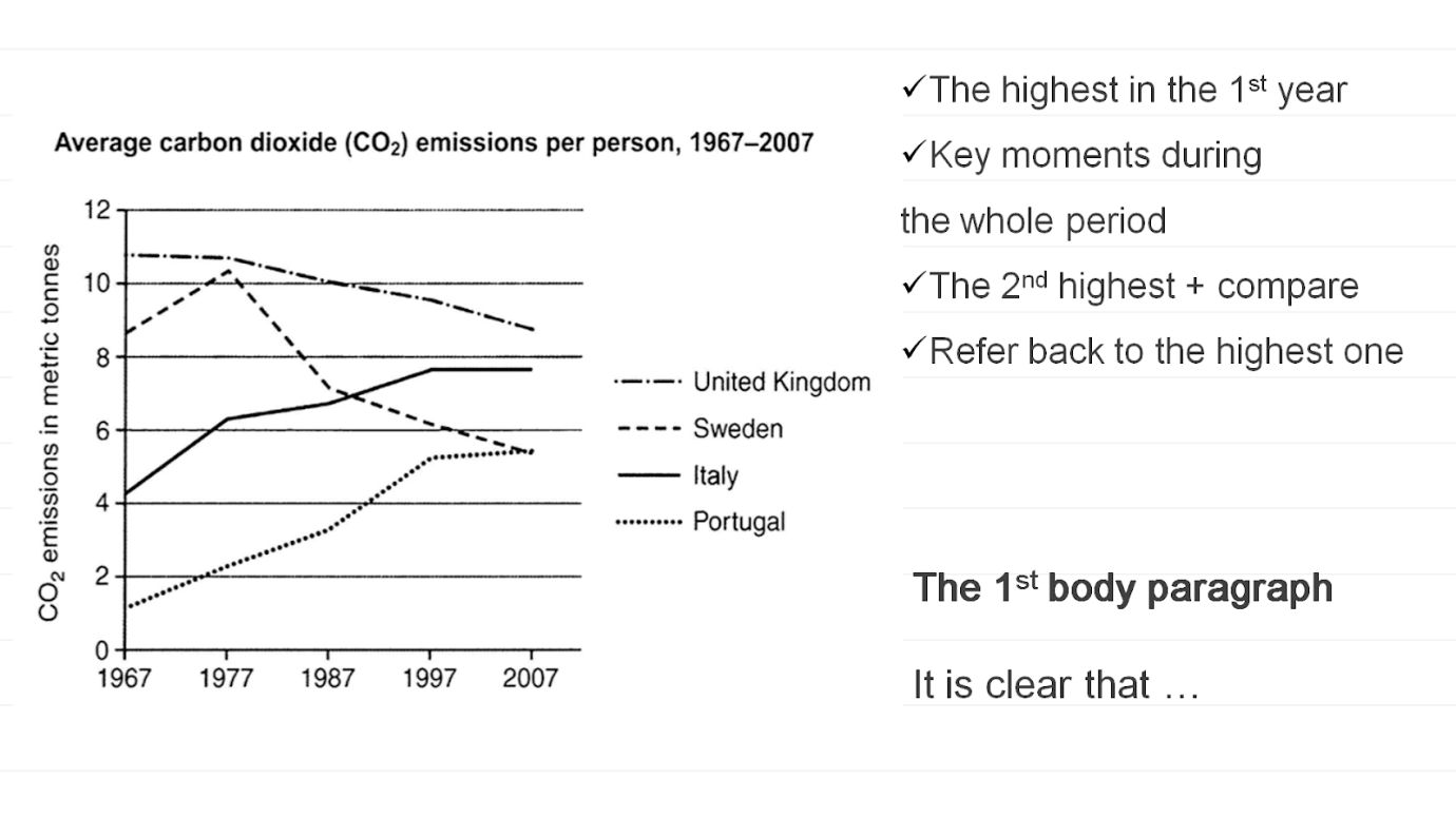
How to choose the figures?
Use these examples to answer some of the questions above:
Overview:
Overall, it can be seen that while the two countries with high levels of CO2 emissions at the beginning of the period saw a decrease, the two countries with low levels witnessed a rise. Although the UK remained the top emitter of carbon dioxide over the period, the gap between it and the other countries was much smaller at the end than at the start.
The 1st body paragraph:
According to the graph, the UK had the highest levels of carbon emissions at the start of the period. The figures started at about 11 metric tonnes in 1967, but then declined gradually to end at around 9 tonnes in 2007. Likewise, Sweden started at a slightly lower (8.8 tonnes), and reached a peak of just over 10 tonnes in 1977, which was almost the same level as the UK. The figures then decreased significantly reaching approximately 5.5 metric tonnes in the final year.
What’s the structure of the report?
1§ Introduction: Paraphrase the Task (1 sentence)
2§ Overview (1-3 sentences)
3§The Main features with Comparisons (3 – 5 sentences)
4§ The Main features with Comparisons (3 – 5 sentences)
Optional: 5§ The Main features with Comparisons (3 – 5 sentences)
Language
Now, let’s take a look at the words we use to describe trends.
Choose 1 ex to do with the learner in class and the others they do at home.
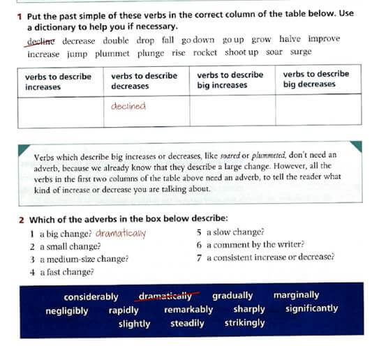
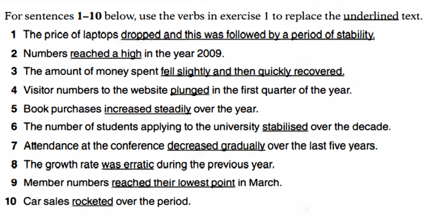
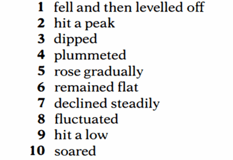
Use the words we’ve discussed and tell me about these trends. Write sentences:
Сообщества IELTS преподавателей:
- Телеграм: https://t.me/ielts_forteachers
- Чат для преподавателей: https://t.me/+Ga8MNYpeqwwyM2I6
- VK: https://vk.com/ieltsforteachers
- Instagram: https://www.instagram.com/ieltsforteachers/
- Facebook: https://www.facebook.com/IELTS4teachers